TEKSAVERS CCR CASE STUDY

5 Step Registration Wizard
Home /  Portfolio / TEKSAVERS CCR
Project Details

Company: TEKSAVERS

My Role: UX/UI Designer

Link: Not Live to Public

The Company
TEKSAVERS is a reseller of used and new IT equipment. They recently created an trading website for their customers to buy and sell IT equipment where they can connect directly to sellers/buyers and post bids similar to eBay.
The Problem
Two months after launching their trading site, only 100 customers signed up to use the website. The owner felt the low number of users was a result of the lengthy registration process and wanted to redesign the registration form.

The Solution

TEKSAVERS needs a quick and easy registration form that helps guide the user through the process while make their choices clear.
Links should be added to the TEKSAVERS registration page from the index page, product page and menu bar so a customer will be able to find it.
Furthermore, the product description of TEKSAVERS needs to be revised so it is more clear what it is and why a customer would use it.

How I Reached My Solution

The Plan

Research

Due to the limited number of users and short time, the product had been live, I performed a heuristic evaluation of the application and conducted contextual inquiries watching customers use the product.

Analysis

I gathered my notes and organized it into relationships using affinity diagram to help determined the common issues customers were having registering with TradeLive.

Conclusion

The length of the registration form was only part of the problem. Access and placement of the form needed to be revised. As well as messaging regarding why.

The Design Process


Mapping the Experience

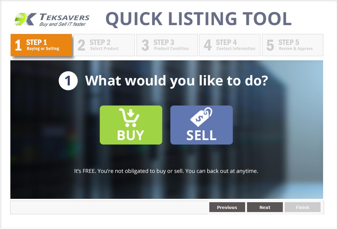
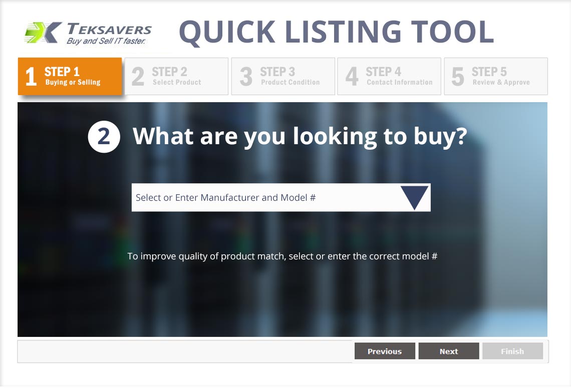
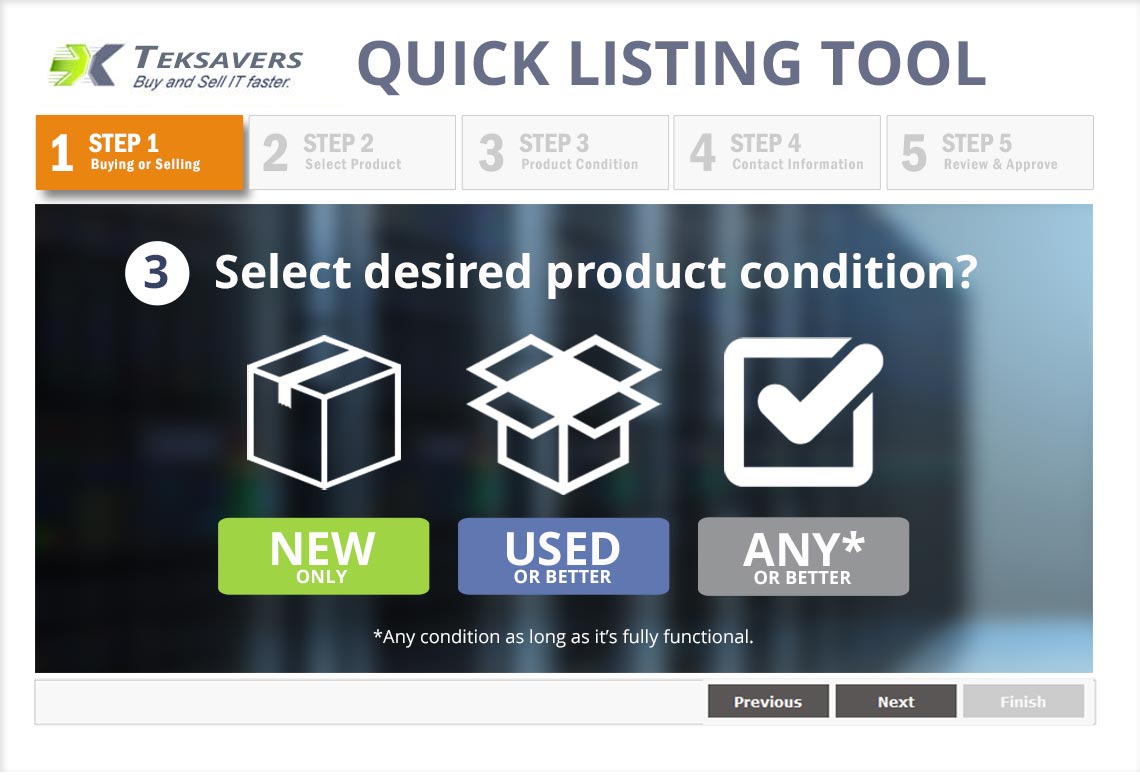
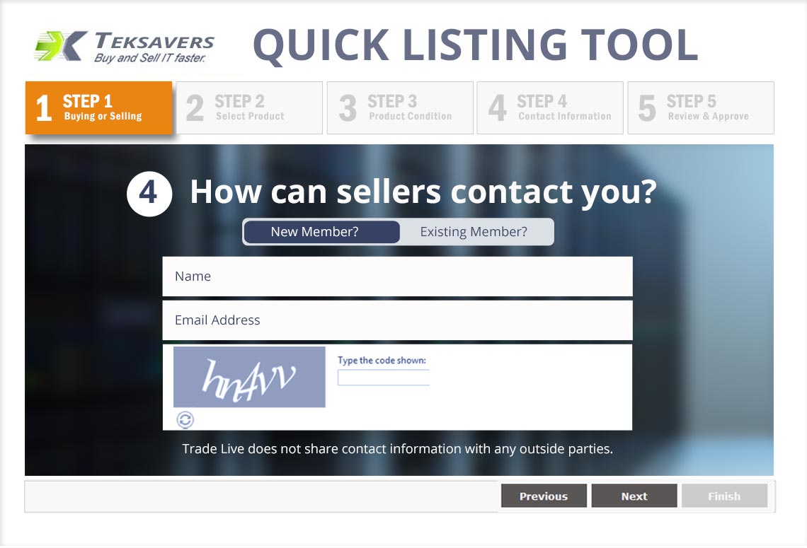
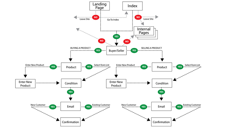
I created a user flow diagram for a buyer and seller that maximizes conversions from visitor to member, trying to match a typical user’s needs.


Creating the Design

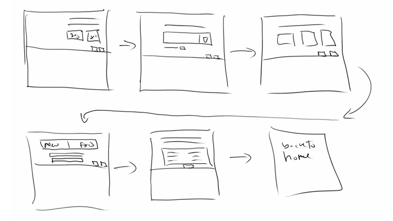
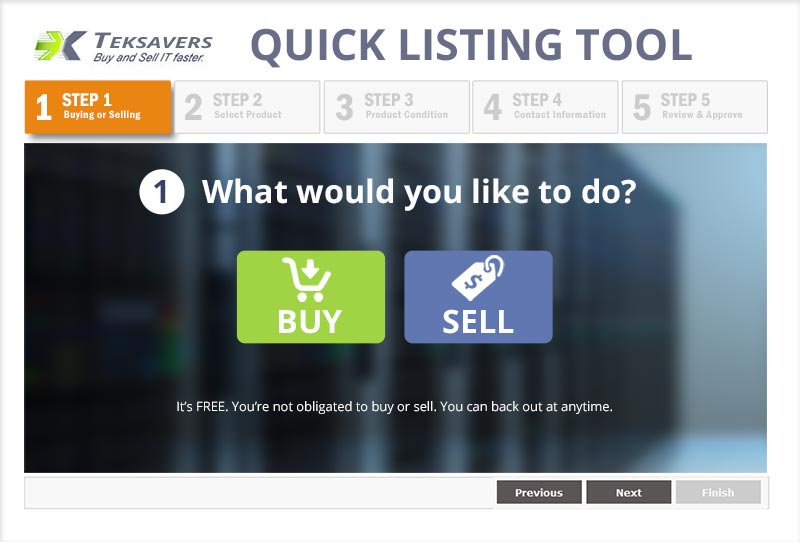
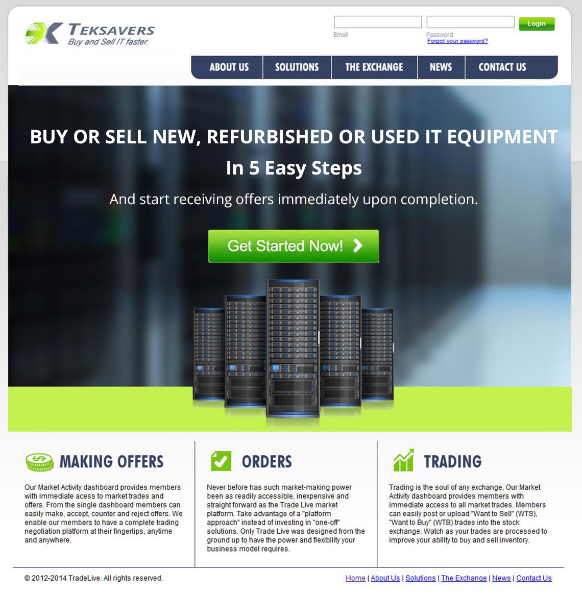
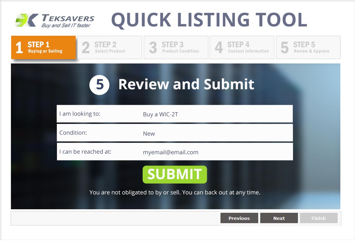
I sketched wireframes during a collaborative meeting with stakeholders. Then I converted them to high-fidelity clickable prototypes of each page.


Testing the Design

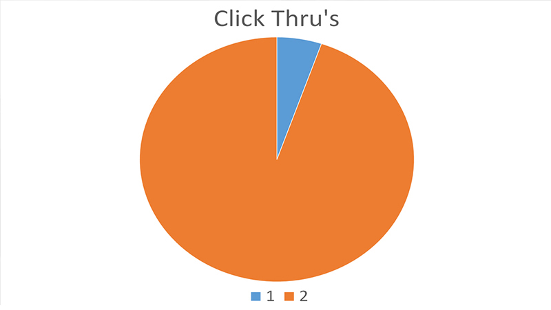
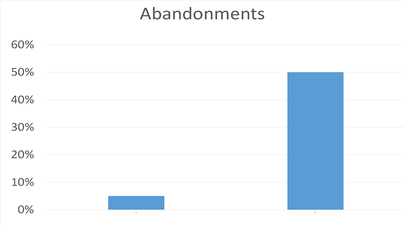
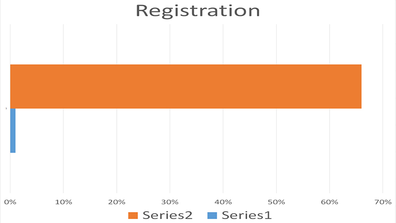
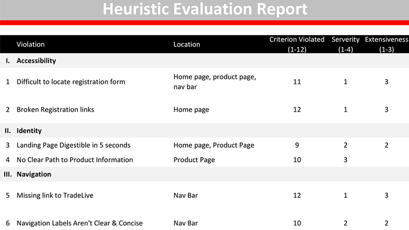
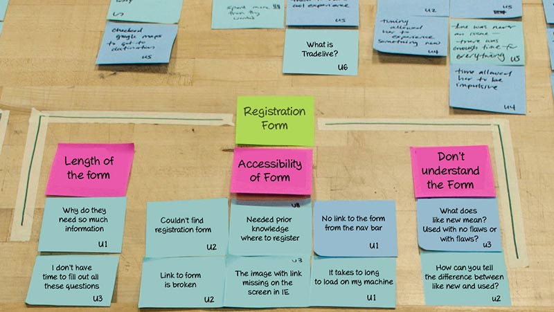
I conducted a usability study of existing users. The goal of the study was to test the prototype and determine if the wizards was easy to find and use.

Results

85% Increase Click-Thru's

After implementing the new index and product pages, the number of users clicking to register went from 5% to 90%.

45% Decrease in Abandonments

The number of users who abandoned the registration process once reaching the page went from 50% to 5%.

65% increase in Registration

The number of registered user out of the number of page visitors per month went from 1% to 66%.

 Previous  All works Next