Database Tools Case Study

Product Family Design System
Home /  Portfolio / Database Tools
Project Details

Company: IDERA, Inc.

My Role: Director of UX and Design

Link: Idera.com

The Product
SQL Database Tools are used for monitoring SQL databases. There are ten applications. Four of the applications also have a desktop version. The other six applications are strictly web applications. The tools were acquired through various acquisitions over the years. A web dashboard had been created so users can view multiple applications on one screen.
The Problem
Two of the SQL Database Tools web applications had been moved to a common web framework that shared styling and components as a way to reduce development costs and simplify code updates. However, QA notice the applications UI's were different. The Product Team wanted to prevent future UI inconsistencies while moving other applications to the new framework.

The Solution

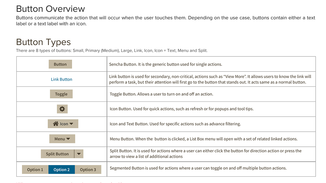
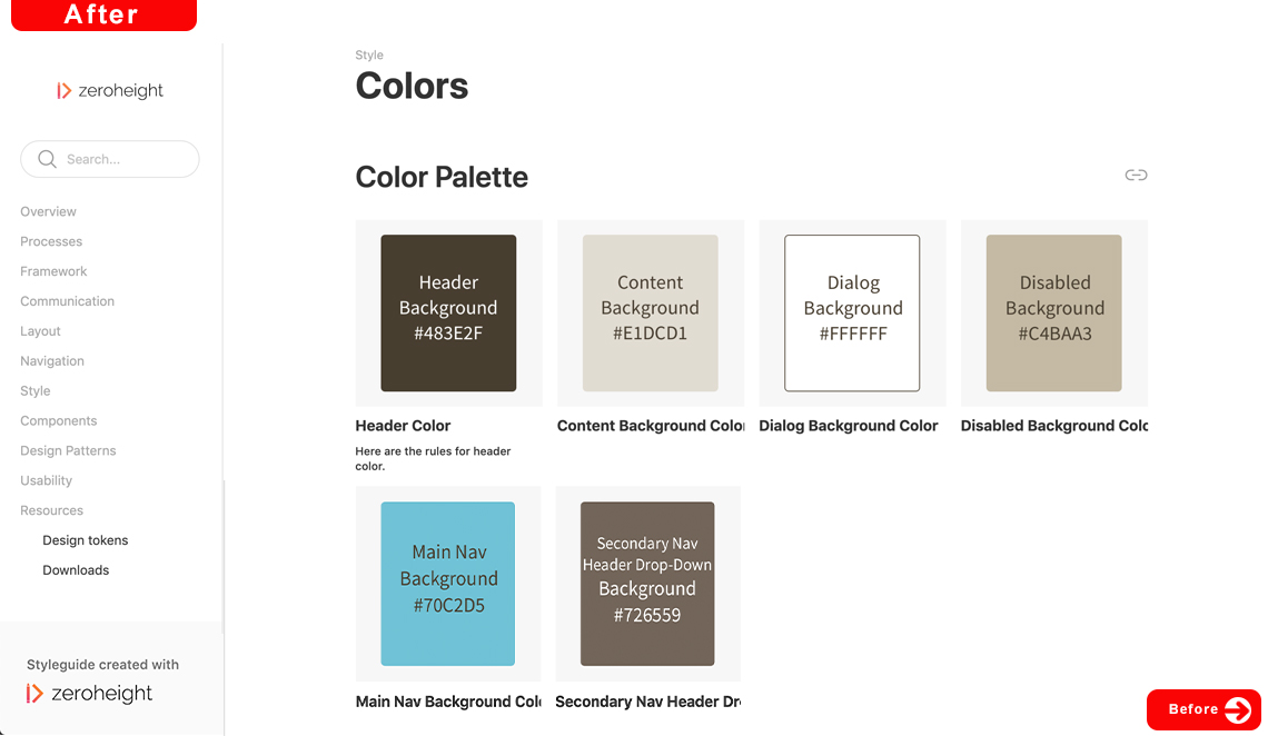
We needed to create a cohesive design system that could be used by designers, product managers and developers. It should have detailed sections on product branding, style guide, grid system, layout, components, animations, design patterns, user experience, terminology, writing, and code. Furthermore designers and developers should be able to obtain necessary assets to create mockups, prototypes and user interfaces.

How I Reached My Solution

The Plan

Empathize

First I wanted to understand how each development team ended up creating custom styling and components instead of using the common components and style sheets provided with the framework. Being new to the team and unfamiliar with the products or company branding, I was in a position to empathize with the developers. So I placed myself in the developers shoes per se and attempted to develop on paper a UI following the project requirements and mockups.

Analysis

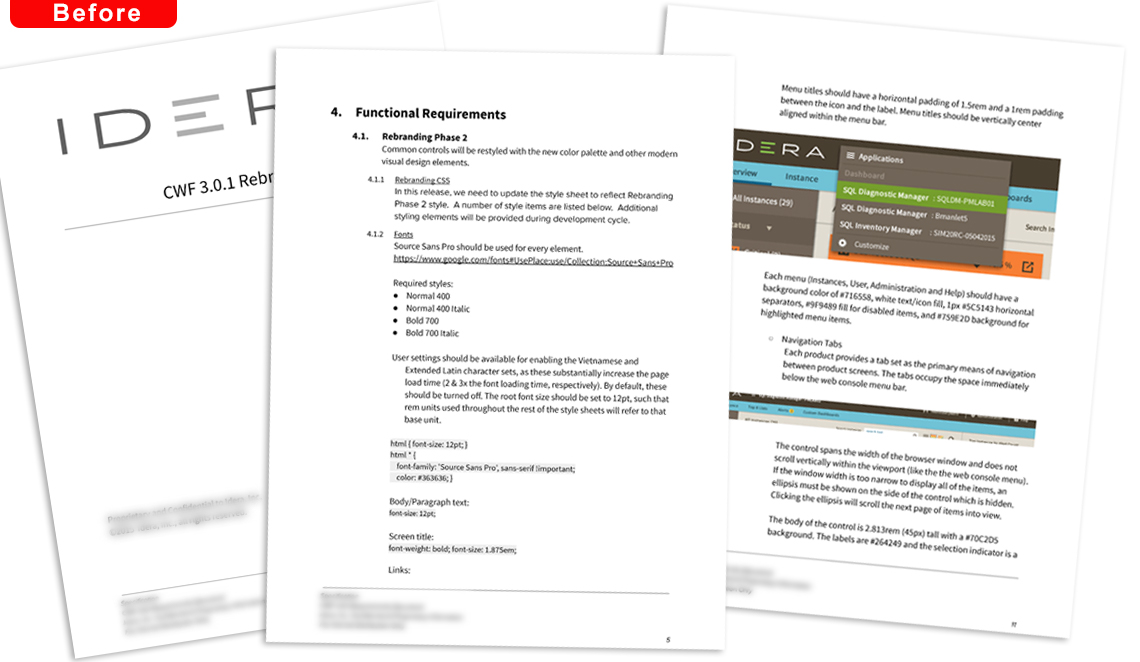
Once I completed my test, I was able to mindmap several developer pain points. The UI styling requirement document was over 100 pages long and not well organized. There were inconsistencies in styling of different components and some design specification were left off. Each product requirements requested modifications to common components. The Engineering requirements didn't specify developers were not allowed to customize components.

Definition

After presenting my analysis to the team, we determined designers, product managers and developers needed better documentation to help guide them in designing, writing requirements and developing consistent user interfaces across each application. The documentation needed to provide guidelines with do's and don’ts. Furthermore, there should be links to download assets and code. Designers also needed to use a common Sketch design library for mockups.

The Design Process


Outline the Design System

I organized several brainstorm sessions with designers, product managers and lead architects outlining what information we needed to include in the design system. What assets we need to provide. What guidelines and processes we needed to define. The different ways and purposes each team member needed to find and reference information.
Creating the Design System

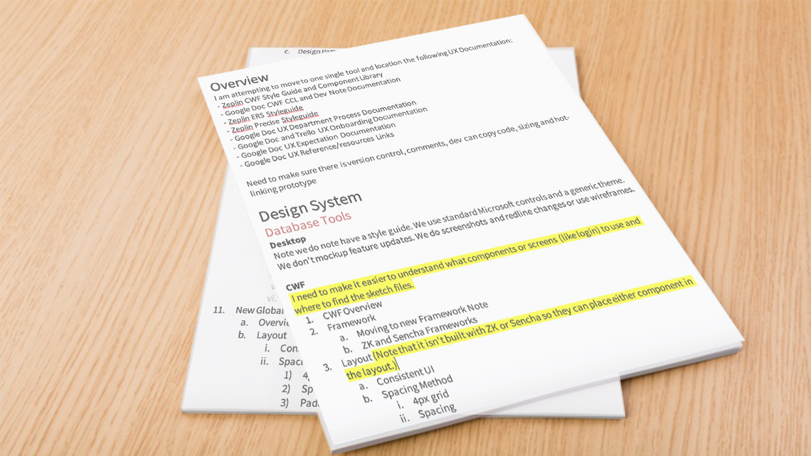
I created the sketch design library and style guide while resolve styling inconsistencies. I placed all the design files and assets into a central location with version management. I initially used google docs to place all necessary documentation provided by each team so we could easily review and revise it. I created a table of contents and organized it by the identified filter options.

Design Challenge
I wasn't able to view the software. Being the type of person who doesn't let roadblocks stop them, I had the sales engineers demo each application while I recorded it.


Testing the Design System

We tested the new design system from requirements to development during the next application release. During the process I closely monitored design mockups, requirements and UI development. I questioned the team when styling or components had differed from design system and quickly made revisions. I continued this process until I no longer spotted any UI discrepancies.

Results

Reduced Inconsistencies

Design mockups inconsistencies reduced 98%.

Increased Commonality

Increase commonality of requirements by 100%

Decreased Errors

Development UI Errors tickets decreased 95%

 Previous  All works Next